This portfolio is designed for desktop viewing.Mobile experience coming soon.

SAVVII
Redesigning Card Management for a Digital Bank
A cleaner, faster, and more controlled way for users to manage their card

I redesigned the “My Card” section to reduce noise, clarify financial data, and surface critical actions like locking the card and making payments.The goal: a structure that supports quick decisions and lowers friction during high-intent moments.
Product
Mobile banking — Card management
Skills
Product design
Interaction design
Information architecture
Interactive prototyping
My role
Product designer
Timeline
Q3 2022 - Q1 2023

Overview
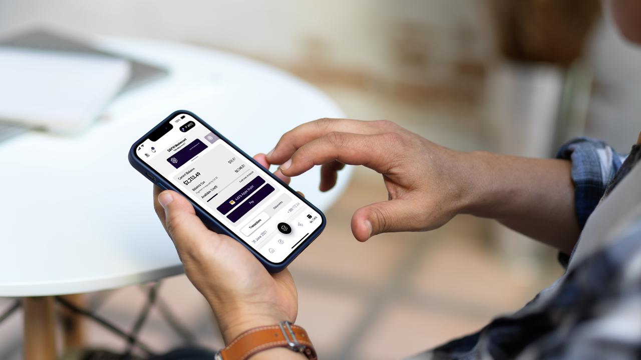
The “My Card” surface in Savvii was intended to act as a quick financial checkpoint, but its structure didn’t support that expectation.The original layout prioritized a large decorative card and scattered key indicators across the screen, making quick verification difficult.I redesigned the experience to foreground essential information, reduce visual load, and introduce a more intentional hierarchy that aligns with real user goals.
Some stats / truths
Users check card pages multiple times per day for quick clarity, not exploration.
Financial surfaces succeed when essential data appears above the fold.
Decorative components reduce efficiency when they dominate vertical space.
Problem
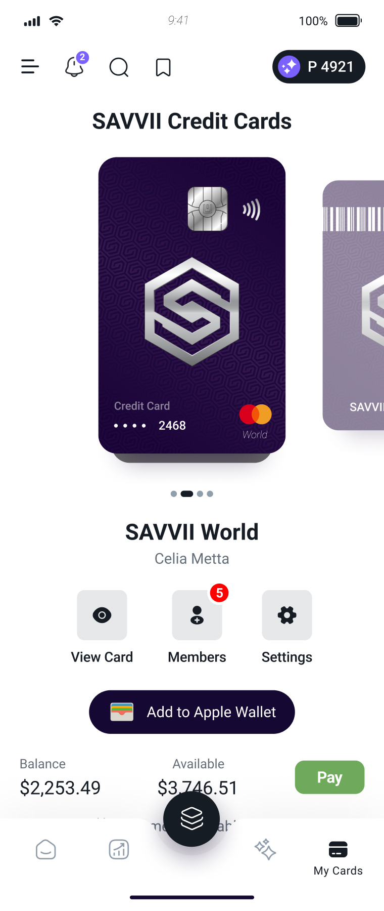
In the previous design, an oversized card component occupied most of the first viewport, forcing users to scroll before reaching meaningful information.Essential metrics like balance, due amount, available credit appeared fragmented across multiple modules, making it harder to understand the card’s state at a glance.Functional controls (Lock Card, Settings, Card Members) shared the same visual weight as informational elements, contributing to a noisy, unfocused page.
Key issues
#1: Misaligned hierarchy
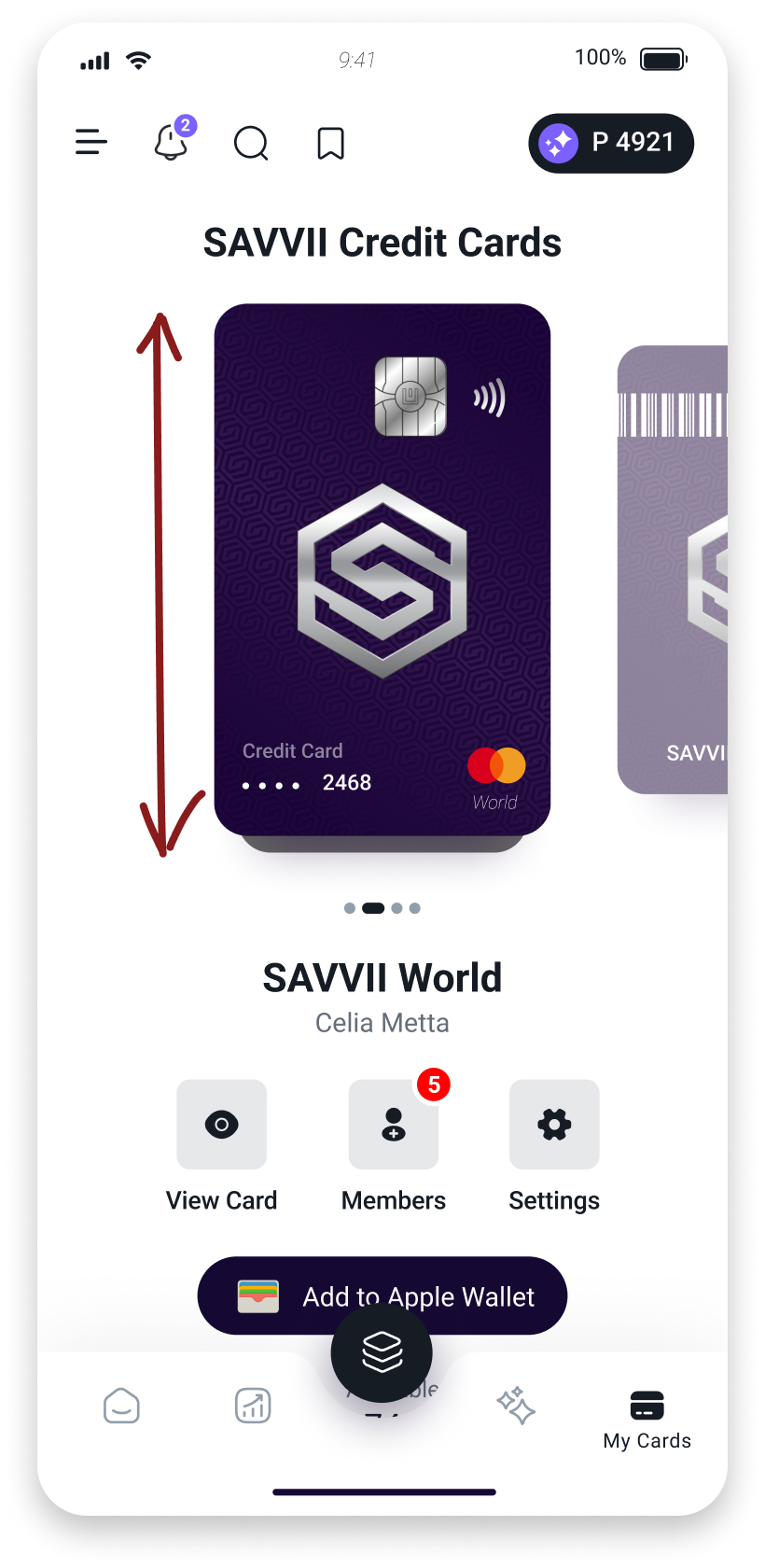
The screen emphasized the card’s visual presentation instead of the information users actually come for. Balance, due amount, and available credit were pushed down, forcing users to scroll before understanding their financial state.
#2: Oversized decorative elements
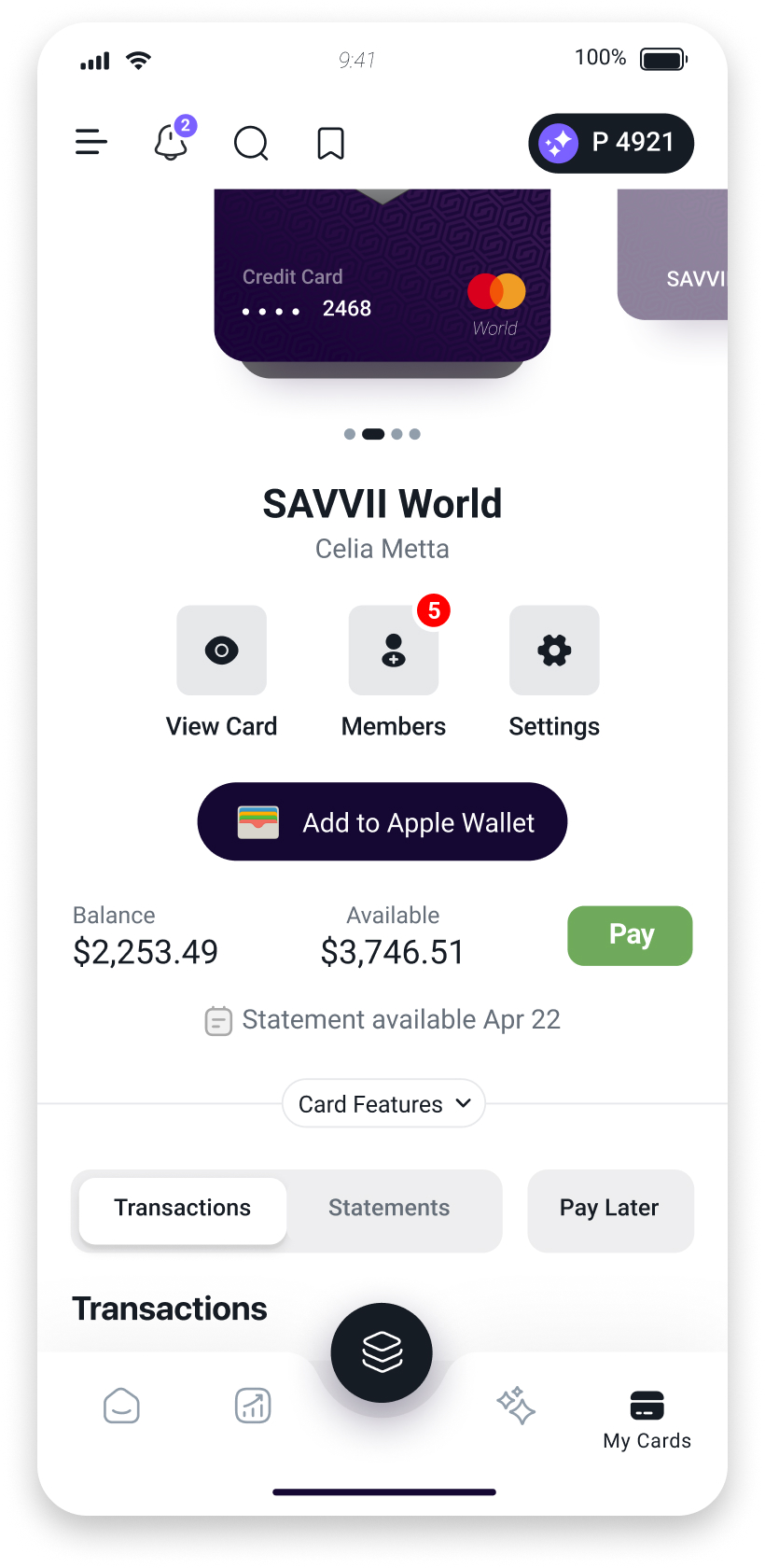
Visual weight was assigned to the card artwork rather than functional content.Non-essential components dominated the layout, reducing the utility of the top surface.
#3: Scattered financial indicators
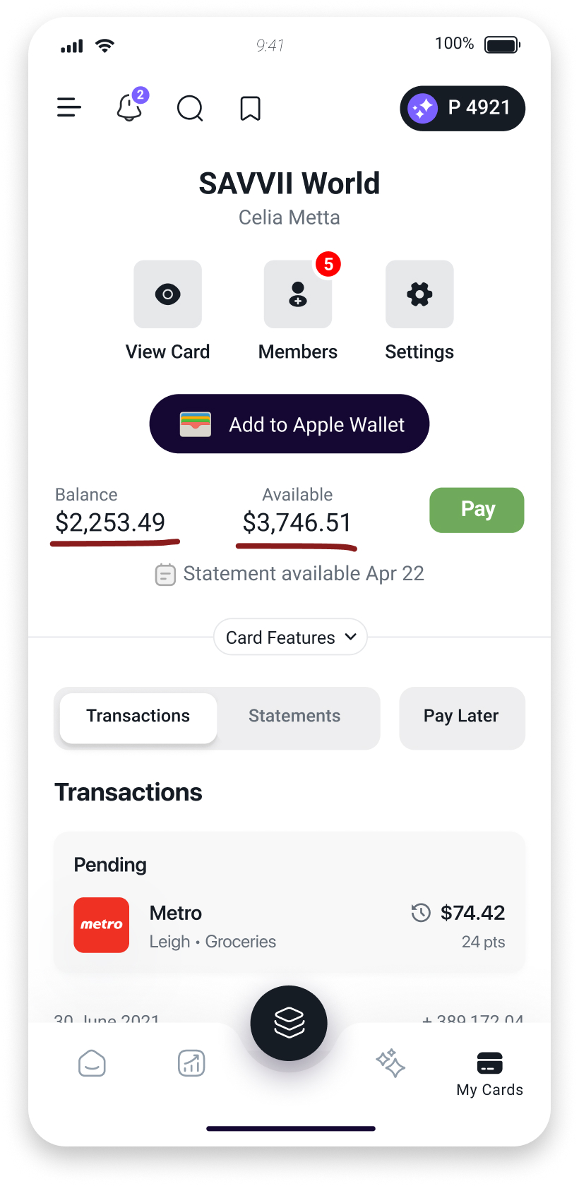
Key metrics were distributed across multiple separate modules, making it harder to interpret the card’s status quickly. Nothing worked together to create a unified financial summary.
#4: Hidden or ambiguous actions
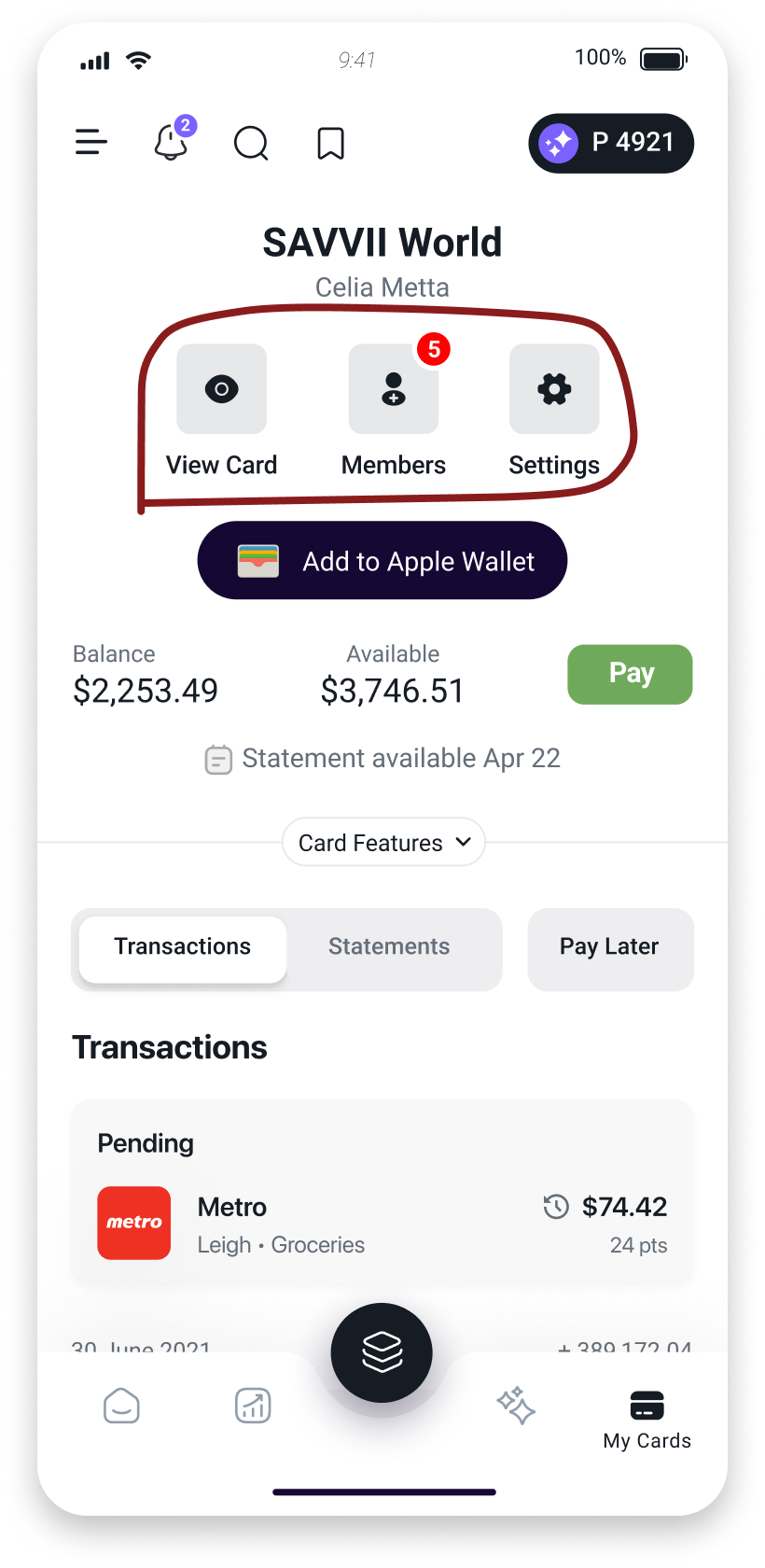
Important card actions were presented as small icons with unclear hierarchy.This made it difficult for users to locate or identify high-risk controls such as locking the card.
Problem #1
Misaligned hierarchy
EXAMPLE
The oversized card component in the old design consumed almost the entire first fold, hiding the balance and due date until the user scrolled.
IMPACT
Users lose immediate clarity, increase their cognitive load, and are more likely to miss critical information such as upcoming payments.
Problem #2
Oversized decorative elements
EXAMPLE
The decorative card graphic appears significantly larger than the financial data, overshadowing the content users need to act on.
IMPACT
Users spend more time navigating the layout instead of assessing their card status, making the experience feel inefficient and visually heavy.


Problem #3
Scattered financial indicators
EXAMPLE
Balance and available credit were separated into isolated blocks, each requiring separate visual attention rather than forming a cohesive overview.
IMPACT
Users take longer to understand card health, which can delay decisions like payments or spending checks.
Problem #4
Hidden or ambiguous actions
EXAMPLE
Icons for View Card, Members, and Settings sat in a row without labeling or prioritization, leaving users to guess which action performed what.
IMPACT
Ambiguous controls introduce friction and can lead users to feel uncertain, especially in urgent moments like needing to lock a compromised card.
Goals
Business goals
Create a more efficient and trustworthy card-management surface that reduces support friction, lowers error rates, and aligns with modern banking standards.Improve the visibility of essential financial information so users can make faster decisions, reducing missed payments and unnecessary customer inquiries.
Success indicators
- Key financial metrics surfaced immediately.
- Fewer scroll-dependent interactions for core tasks.
- More predictable placement of secondary actions (Lock Card, Settings, Members).
- A layout that reinforces confidence and reduces confusion.
User goals
Get a clear, immediate read of their financial status without scrolling or interpreting scattered modules.Access secondary controls when needed, without having them clutter the main surface.Move through the page quickly and make decisions for example checking balance, confirming due amount, taking actions without friction.
Success indicators
- Balance, due amount, and available credit visible at first glance.
- A cleaner hierarchy that reduces cognitive load.
- Secondary actions available through an intentional gesture, not constant noise.
- A calmer interface that reads in one pass.
Process #1
Reframing the surface
The original experience treated the card as the centrepiece of the page.
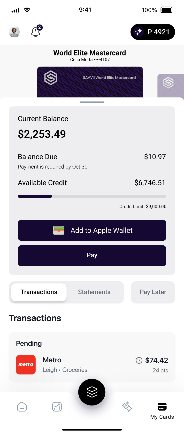
I reframed the surface around decision-making instead; prioritizing the information users check most frequently, such as balance, due amount, and available credit.
The redesign shifts the interface from decorative presentation toward functional clarity.
After
Before
Visual priority assigned to decoration
Priority shifted to actionable data
Final Design
The final experience shifts the focus from decorative presentation to financial readability.
Essential information is surfaced immediately, while secondary and security-sensitive actions are progressively layered to reduce noise without sacrificing accessibility.
The result is a clearer, faster, and more intentional card-management experience.
Impact
Faster financial understanding
The redesigned structure surfaces balance, due amount, available credit, and payment actions immediately, reducing the need for scanning across fragmented modules.
Reduced visual noise
Secondary actions and decorative elements no longer compete with core financial information, creating a calmer and more focused experience.
More intentional interactions
Security-sensitive actions such as locking the card or revealing card details are progressively layered, improving clarity while maintaining accessibility and control.
Improved transaction readability
Pending and posted activity are visually separated into clearer groups, making transaction history easier to scan, review, and understand at a glance.
Learning
Hierarchy shapes confidence
This project reinforced how strongly information hierarchy affects trust in financial products. Even when the right information exists, poor prioritization can make users feel uncertain or overwhelmed.
Not every action deserves equal visibility
One of the biggest design decisions was learning what not to surface immediately. Layering secondary and high-risk actions created a more focused experience without reducing functionality.
Financial interfaces should support decision-making, not browsing
Users do not approach banking surfaces to explore. They come to verify, act, and leave quickly. Designing around that behaviour led to a faster and more intentional interaction model.
Want to learn more about this project?
Get in touch to request a case study.
Get in touch

Next project
Utradea

