This portfolio is designed for desktop viewing.Mobile experience coming soon.

Utradea
From profile-first to performance-first
Turning behavioural data into a clearer portfolio experience

I used behavioural analytics to turn scattered user sessions into a clearer product direction for Utradea’s portfolio experience.
By looking at where users scanned, clicked, paused, and dropped off, I uncovered a core mismatch: the page was structured like a profile, while users were trying to evaluate portfolio performance and find their next action.
Product
Investment research platform — Portfolio experience
Skills
UX research
Behavioural analytics
Information architecture
Product strategy
Interaction analysis
My role
User experience researcher
Timeline
Q1 - Q3 2022

The challenge
The page had the data. The problem was the hierarchy.
Utradea’s portfolio page included profile identity, authority score, return metrics, watchlists, ideas, holdings, change logs, and performance data.
But behavioural data showed that users were not always reaching the information that mattered most. The page prioritized profile context, while users appeared to be looking for performance signals, portfolio status, and a clear next action.
Project goal
Identify where users lost orientation and turn behavioural patterns into a clearer, more performance-led portfolio experience.
Key research questions
Where do users look first when they land on the portfolio page?
What helps users understand portfolio performance fastest?

Which actions are not visible or clear enough?
What content is being pushed too low in the page?
Recommended direction
Make the first viewport do more work.
The portfolio page needed to shift from a profile-led layout to a performance-led structure. Instead of giving early space to identity and banner visuals, the first viewport should help users understand portfolio status and decide what to do next.
Design direction
Reorganize the first screen around performance, key actions, and portfolio status so users can evaluate faster and act with more confidence.
What to prioritize
Portfolio performance summary
Primary actions
Holdings, watchlist, and ideas
Change log and supporting activity
Compact profile identity
Shifting the hierarchy
Shift the portfolio page from profile context to performance context in the first viewport.
Move portfolio status higher
Surface return metrics, portfolio health, and summary signals earlier.
Bring key actions forward
Make create, login, and write-idea actions easier to find.
Reduce profile dominance
Keep identity and banner visuals supportive, not leading.
Create a clearer scan path
Let users read orientation, performance, then action in that order.
Before
Profile identity and passive context led the page.

After
Portfolio status, performance signals, and key actions lead the page.
Research approach
Reading behaviour, not assumptions.
I combined Google Analytics and LogRocket to connect broad usage patterns with page-level behaviour.
Google Analytics
Device patterns, session depth, and broader usage behaviour.
LogRocket heatmaps
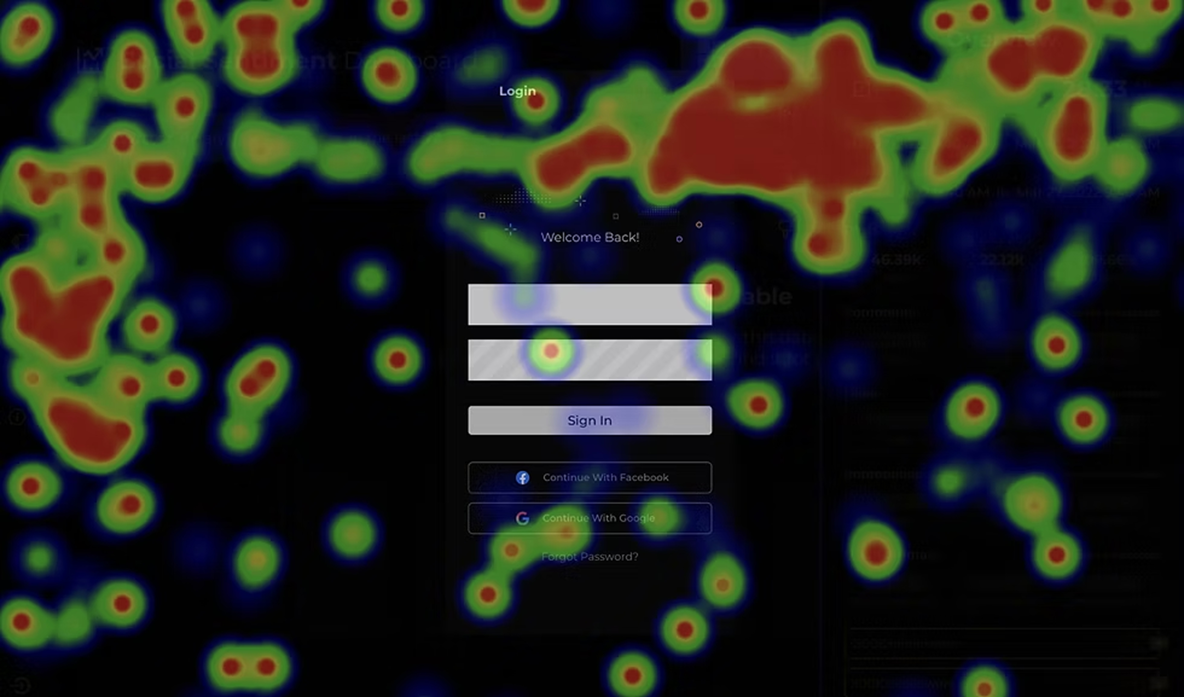
Click concentration, hover patterns, and areas of attention.
Session recordings
Hesitation, repeated actions, missed cues, and moments of friction.

Device data revealed two distinct modes: mobile users were mostly scanning, while desktop users showed deeper portfolio review.
Usage context

Behaviour signals

Pattern synthesis
Product direction
Key finding #1
Performance summary was the real entry point
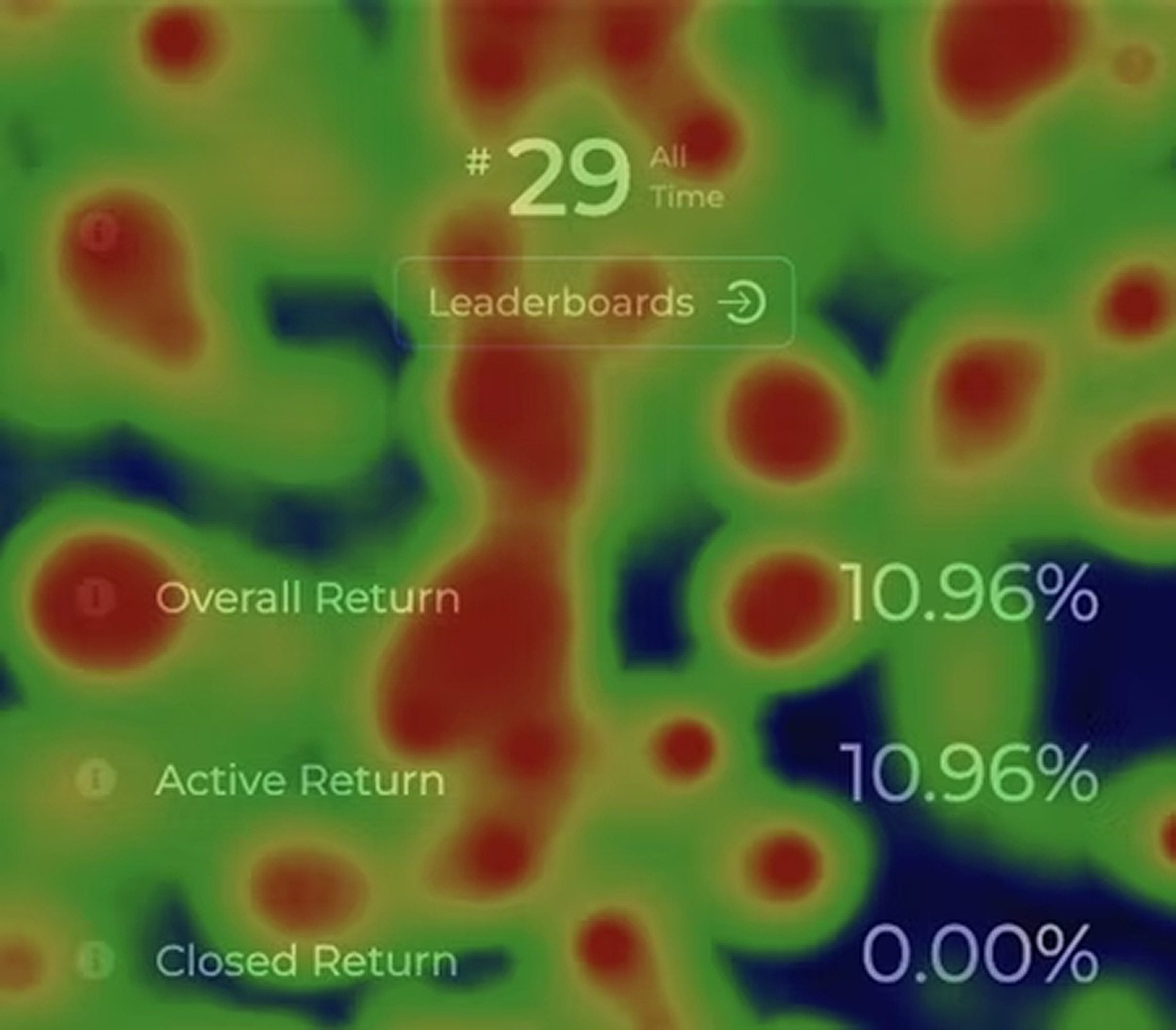
Users showed strong attention around overall return, ranking, and summary-style information. The overall return area received more attention than the active or closed return details.
The page did not need more data. It needed a clearer opening read.
Signal
Summary metrics received concentrated attention.
Interpretation
Users wanted the portfolio story first, before moving into detailed states.
Recommendation
Bring a stronger portfolio summary card closer to the top of the page, including overall return, active return, closed return, holdings summary, and watchlist/ideas status.
Synthesis
The issue was not missing functionality. It was a product hierarchy mismatch.
Across the research, the same pattern repeated: users looked for orientation before evaluation, wanted performance signals before details, and responded more strongly when actions communicated clear value.
The portfolio page had useful features, but the experience did not make the next best action obvious enough.

Users were not browsing a profile.
They were trying to evaluate performance.
The pattern across sessions

Look for orientation
Users scan identity, authority, and navigation first to understand where they are.


Look for performance
They focus on summary metrics, performance signals, and credibility indicator.

Look for action
Users searched for clear actions that helped them continue, create, or take the next step.

Profile-first
Identity and visual context took priority.
Performance-first
Portfolio status, key actions, and performance signals move higher.

The opportunity was not to add more.
It was to move what mattered most higher in the experience.
Impact
Product impact
The research gave the team a clearer basis for improving the portfolio experience. Instead of treating the page as a profile surface, it reframed it as a performance surface; one where hierarchy, action placement, and first-viewport clarity mattered most.
It helped turn broad behavioural patterns into concrete product direction, especially around what should move higher, what should become more actionable, and what should become quieter.
What this informed
- Reprioritizing performance signals in the first viewport.
- Bringing high-value actions closer to where users were already looking.
- Reducing the dominance of profile identity and decorative context.
- Creating a clearer scan path from orientation → evaluation → action.
User impact
The recommended direction aimed to make the portfolio page easier to read, faster to evaluate, and more actionable at a glance.Users should not need to work through profile-heavy content before understanding portfolio status or deciding what to do next.
By aligning the layout with observed behaviour, the experience becomes more supportive of quick judgement and more confident action.
Expected experience outcomes
- Performance status becomes visible earlier.
- Key actions are easier to find and understand.
- Important content is surfaced with less scrolling and less hesitation.
- The page reads as a clearer, more guided experience.
Learning
Analytics are evidence, not answers.
This project taught me to be careful with behavioural data. A hover does not automatically mean confusion. A click does not automatically mean intent. A short session does not automatically mean failure.
The value came from looking for repeated patterns across sessions and connecting those patterns back to product structure.
The biggest lesson was that a strong portfolio experience is not about showing more data, it is about showing the right data first.


Want to learn more about this project?
Get in touch to request a case study.
Get in touch

Next project
Nika Agency